
 jannes at court-side.de


Just a quick intro to the following chart: I tried a new approach which might, at first sight, seem counter-intuitive. However, if you care enough to try to orientate yourself for a moment, it does hold a lot of information. I’ll try to give some examples below, but am in kind of a hurry (Alba game tonight).
First of all, here’s the chart:
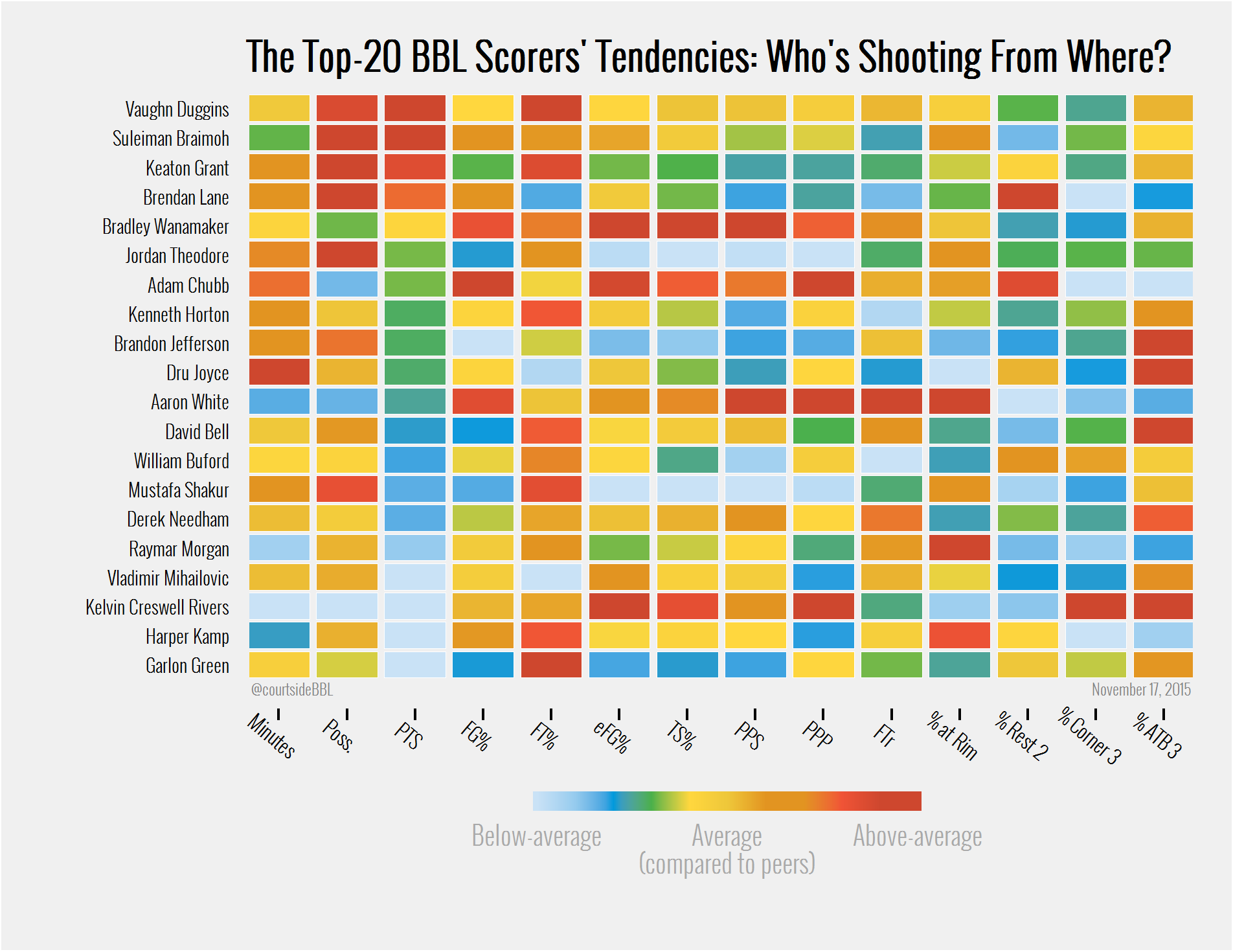
The Top-20 BBL Scorer’s Tendencies: Who’s Shooting (Efficiently) From Where?
To clarify the abbreviations: On the x-axis, that’s Minutes, Possessions, Points per Game, FG%, FT%, eFG%, TS%, then Points Per Shot, Points per Play/Possession, Free-throw rate (as in how many free-throws does a players shoot for every field goal attempt he takes; look at Aaron White, he’s crazy), followed by how many of a player’s shots come from the restricted area (% at Rim), everything outside the restricted area, but inside the arc (% Rest 2), from the cornes (% Corner 3), and from above-the break (% ATB 3).
What I did is I took the top-20 players in points per game and looked at, first, how efficiently they have been shooting so far (eFG%, TS%, PPS, PPP, whatever you like best), and, second, where their shots came from (FTr and the % from the different areas). That’s the categories on the x-axis (bottom). Players are on the y-axis (left). The tiles are colored according to how well the given player compares to the other 19 in whatever category your are looking at.
Let’s take a look at the points column, third from the left. Colors run smoothly from red (Vaughn Duggins, above average) to light-blue (Garlon Green, below average). That’s because the players are in order of how many points they score per game. The other columns do not show a similar order because all these players differ in how they score their points.
I have two ways of looking at it.
1. Per player: How does Keaton Grant, for example, rank against the other players over the different categories? On first sight: the more yellow-to-red boxes, the better; the more blue-to-green in the player’s row, the worse he performs in comparison to his peers. Turns out he uses a lot of possessions in slightly above-average minutes, shooting well from the free-throw line (red boxes), but is pretty average and below in all other areas.
2. Per category: Instead of looking row-wise, one could just as well look column-wise. Who’s the most-efficient scorer? I go with Points per Play/Possession (PPP) and see, for example, that K. C. Rivers does rank pretty high here. He’s near the bottom of the table, which means he’s not scoring as many points per game as the the other players. But he scores his fewer points on a lot fewer possessions as well, making him more efficient. So I look at how he tends to score: The far-right columns show how often a players goes to the line, and how many of his shots come from near-the-rim (in the restricted area), from the rest of two-point land (high-post and mid-range), from the corners or above-the-break.
Turns out he doesn’t shoot from 2 all that much and is not a high-volumne free-throw shooter. However, he shoots a lot of above-the-break 3s and crushes all other 19 players in how many of his shots are corner 3s. His field-goal percentage is pretty low, but as he’s shooting mainly from 3, that’s to be expected. His PPP accordingly shows that he’s doing more than fine.
Gotta run, if you have any questions, hit me up on Twitter or in the comments below (noone has ever commented on anything here, but who knows).
I’ll try to do a better job of explaining in the future, too!